5.20241.9
5.20241.9
日付入力:カスタム表示
InputDateとそのドロップダウンカレンダーの外観は、CSSを使用してカスタマイズできます。また、カレンダーのformatItemイベントを使用して、ドロップダウンカレンダー内の特定の日付の外観をカスタマイズすることもできます。
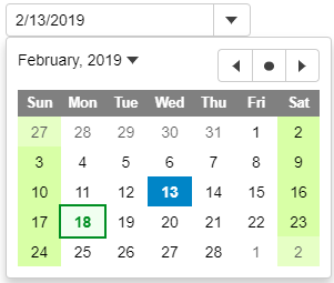
次の例のInputDateは、週末と休日にカスタムスタイルを適用します。
HTML
<input id="theInputDate">
CSS
.wj-calendar {
    max-width: 21em;
}

.wj-calendar .wj-header {
    color: white;
    background: #808080;
}

.wj-calendar .date-holiday:not(.wj-state-selected) {
    font-weight: bold;
    color: #008f22;
    background: #f0fff0;
    outline: 2pt solid #008f22;
}

.wj-calendar .date-weekend:not(.wj-state-selected) {
    background-color: #d8ffa6;
}
JavaScript
import * as wijmo from '@mescius/wijmo';
import * as input from '@mescius/wijmo.input';
import { getHoliday } from './data';

function init() {
    // InpuDateアイコンを下向き矢印ではなくカレンダーに変更します(すべてのInputDateコントロールに適用)
    input.InputDate.controlTemplate = '<div style="position:relative" class="wj-template">' +
        '<div class="wj-input">' +
        '<div class="wj-input-group wj-input-btn-visible">' +
        '<input wj-part="input" type="text" class="wj-form-control" />' +
        '<span wj-part="btn" class="wj-input-group-btn" tabindex="-1">' +
        '<button class="wj-btn wj-btn-default" type="button" tabindex="-1">' +
        '<span class="wj-glyph-calendar"></span>' +
        '</button>' +
        '</span>' +
        '</div>' +
        '</div>' +
        '<div wj-part="dropdown" class="wj-content wj-dropdown-panel" ' +
        'style="display:none;position:absolute;z-index:100">' +
        '</div>' +
        '</div>';

    // 現在の月/年を表示するために使用される書式を変更します(すべてのInputDateコントロールに適用)
    wijmo.culture.Globalize.calendar.patterns['y'] = 'MMMM yyyy';

    // InputDate
    let theInputDate = new input.InputDate('#theInputDate');

    // InputDateのカレンダーの項目を書式設定します(週末や祝日にスタイルを適用)
    theInputDate.calendar.formatItem.addHandler((sender, e) => {
        let weekday = e.data.getDay(), holiday = getHoliday(e.data);

        wijmo.toggleClass(e.item, 'date-weekend', weekday == 0 || weekday == 6);
        wijmo.toggleClass(e.item, 'date-holiday', holiday != null);
        e.item.title = holiday;
    });
}
また、ドロップダウンボタンに表示されるアイコンをカスタマイズするには、InputDateのcontrolTemplateプロパティを変更するか、コードを使用してコントロールの内容を変更します。最初の方法は、アプリケーション内のすべてのInputDateコントロールに影響し、2番目の方法は1つのコントロールにのみ影響します。
詳細な実装方法については、カスタム表示のサンプルを参照してください。