5.20241.9
5.20241.9
ポップアップ:トランジション
PopupコントロールのfadeInプロパティとfadeOutプロパティは、Popupが表示/非表示になるときに簡単なアニメーションを追加します。
CSSベースのカスタムアニメーションを作成することもできます。それには、shownおよびhidingイベントに応じてPopupのホスト要素にクラスを追加または削除し、これらのクラスに基づいてアニメーションを適用するためのCSSルールを定義します。
次の例では、PopUpダイアログとして表示されるログインフォームを作成し、カスタムアニメーションを使用してダイアログを開く/閉じています。
HTML
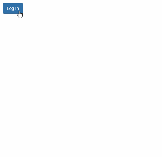
<button id="btnLogin" class="btn btn-primary">
ログイン
</button>
<!-- ログインフォーム -->
<form id="frmLogin" class="custom-animation">
<h4 class="modal-header">
ログイン
<button type="button" tabindex="-1" class="close wj-hide">×</button>
</h4>
<div class="modal-body">
<label>
メール:
<input class="form-control" required type="email" />
</label>
<br />
<label>
パスワード:
<input class="form-control" type="password" required pattern=".{4,}"
title="4文字以上入力してください。" />
</label>
</div>
<div class="modal-footer">
<button class="btn btn-primary" type="submit">
ログイン
</button>
</div>
</form>
CSS
/* フェードインおよびフェードアウト用CSSアニメーション */

.custom-animation {
    opacity: 0;
    transform: rotate3d(1, .5, .5, 180deg) scale(0.1);
    transition: all ease-in .4s;
}

.custom-animation-visible {
    opacity: 1;
    transform: none;
}
JavaScript
import * as wijmo from '@mescius/wijmo';
import * as input from '@mescius/wijmo.input';

function init() {
    let login = new input.Popup('#frmLogin', {
        fadeIn: false,
        shown: (sender) => {
            wijmo.toggleClass(sender.hostElement, 'custom-animation-visible', true);
        },
        hiding: (sender) => {
            wijmo.toggleClass(sender.hostElement, 'custom-animation-visible', false);
        }
    });
    //
    document.querySelector('#btnLogin').addEventListener('click', () => {
        login.show(true);
    });
}